Logos in the Technological World
26.6.2017
We have compiled for you some prominent and well-known logos examples that we loved, starting with one of the oldest and leading high-tech companies in the world – Amazon.

Amazon, started out in 1994 as a small online bookstore. The company’s founder and CEO, Jeff Bezos, wanted to call it Cadabra, like “Abra Cadabra”, but his lawyer immediately advised him to change the name as it sounded too similar to cadaver. Bezos ended up opting for Amazon, as the world’s longest river and “the largest bookstore in the world.” Their first logo was designed accordingly.
Caution, these images are not for everyone…:

Over the years Amazon has evolved, and with it the logo that has accompanied it since 2000. It is no longer just a bookstore, it is a store for everything and this is also what the logo symbolizes. The arrow leading from A to Z implies that on Amazon you can indeed find everything, from A to Z. Oh, and it also creates a cute smile, if you want to be sociable to the audience. In 2017, Amazon has been already far beyond an internet store – they have smart home systems, Kindle, drones-operated delivery service and even a real, physical store with an innovative concept.
Now we move on to the next company, one of the most successful start-ups in the world, one that has completely changed the way we travel and broke the tourism market – AirBNB.
Whether you have used AirBNB services or not, you have to agree that their idea was revolutionary (still is): the option to get accommodation in someone else’s apartment instead of depending on an expensive hotel, thus also offering a greater availability to travelers, a different experience, and in most cases a cheaper one.
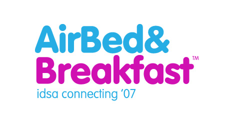
When Brian Chesky and Joe Gebbia (both started as graphic designers, by the way) decided to set up AirBNB in 2008, they initially named it by the long and un-catchy name Airbed & Breakfast, which simply said what they do – bed on an inflatable mattress and breakfast, and so their logo would have looked like:
The beginning of AirBNB was not straightforward, but the way they went is a completely unique story that needs to be taught in entrepreneurship schools.
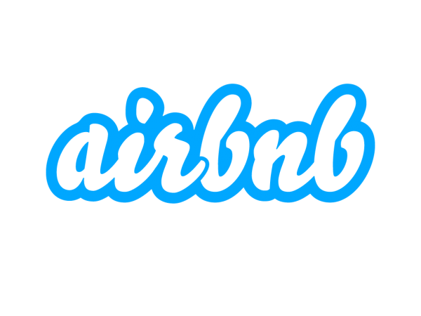
In 2009, they decided to change the approach, and with it the branding. They shortened the name to Airbnb, and the logo underwent several variations until they came up with their latest and most talked about logo.

In 2014, airbnb, was already a huge and well-known start-up, and the drastic change in their logo hit waves – whether due to its shape which was immensely entertaining to people (let your imagination do the work) or whether due to critiques from other designers.
The new icon, nicknamed The Belo, is an abbreviation of Belonging, because that’s what Airbnb is trying to convey. When you sleep in someone else’s apartment you feel like you belong, you do not feel like a tourist.

The Belo symbolizes and consists of 4 things, as they made a point to explain in a YouTube video: people, location, heart and the letter A of Airbnb. The new color and the new icon have become the hallmark of the company, which has already become more than a website or app for finding a place to stay.
Another long-standing company, although its name is not often mentioned, is Cisco, the giant company that provides communications equipment, but is mostly famous for its routers.
Cisco was founded in 1984 in San Francisco. Have you been able to figure out how they came up with their name?
Their love for the city in which they began their journey does not end with the name of the company, because its logo has always symbolized the Golden Bridge, the iconic symbol of the city. A bridge connecting the past to the future and a bridge that symbolizes connection, like the communication means they provide.

This is Cisco’s first logo, in case you were wondering, more a bridge, less technology, and good thing they decided to move forward.
For your next vacation there is a chance that you will do a few things: book plane tickets, book somewhere to stay (maybe even through the above Airbnb) and start figuring out what to do. And how are you going to do that? Probably through TripAdvisor.

Even if you have not used TripAdvisor, the largest review site when it comes to attractions and restaurants, you may have encountered their logo on the door of a business in Israel or abroad, in one of the tens of thousands of places they have recommended.
The logo that accompanies them since their inception in 2000, may not be the most visually appealing, but it certainly represents TripAdvisor’s values in the best way.
Let’s try to think like the company that designed the logo for them – what can symbolize travel? Compass, map, globe, backpack… or binoculars. What could symbolize wisdom? After all, this is a website I should be able to trust – Brain? Books? Maybe some smart animal… like an owl? Nailed it!
Yes, it’s an owl with binoculars, but that’s not all. Have you ever wondered what the eyes symbolize – one green, and the other red? The green eye symbolizes all the recommended things to go for, while the red eye is all the things worth getting away from. Follow the owl, he knows the way.
Finally, our own Israeli app – blue-and-white icon as our flag colors that you may have already heard of – Paybox.
The Israeli start-up Paybox started out about 3 years ago, endeavoring to bring the news of social payments to Israel. With the app, you can open a group, invite your friends, and raise money for a specific purpose – BBQ on Independence Day, an expensive gift for a friend, collecting money for a bachelorette party, or anything else you can think of.
Their icon, with all its simplicity, symbolizes exactly what the app does. It can look like a person with his hands up (probably happy), or as a coin that goes into a box, or a cash box.
All in all, the icon does the job.
These are just 5 companies, small and large, out of an infinite number of start-ups, websites, applications or huge high-tech companies operating in Israel and around the world – all of which have one goal – to stand out. In the end, the icon that accompanies the app, the logo displayed at the top of the website or the owl sticker everywhere – is what will be remembered.
Want to know how to best brand your startup and make the whole world know who you are? Leave it to us.


